数据插槽说明
关于
- 数据插槽只有新版本2025.03 月下载的代码或者更新后才能使用
- 支持在生成的页面使用 slot 直接配置自定义组件,如:自定义弹出框、弹出框选择数据等功能
数据插槽名称
| slot插槽名称 | 插槽描述 |
|---|---|
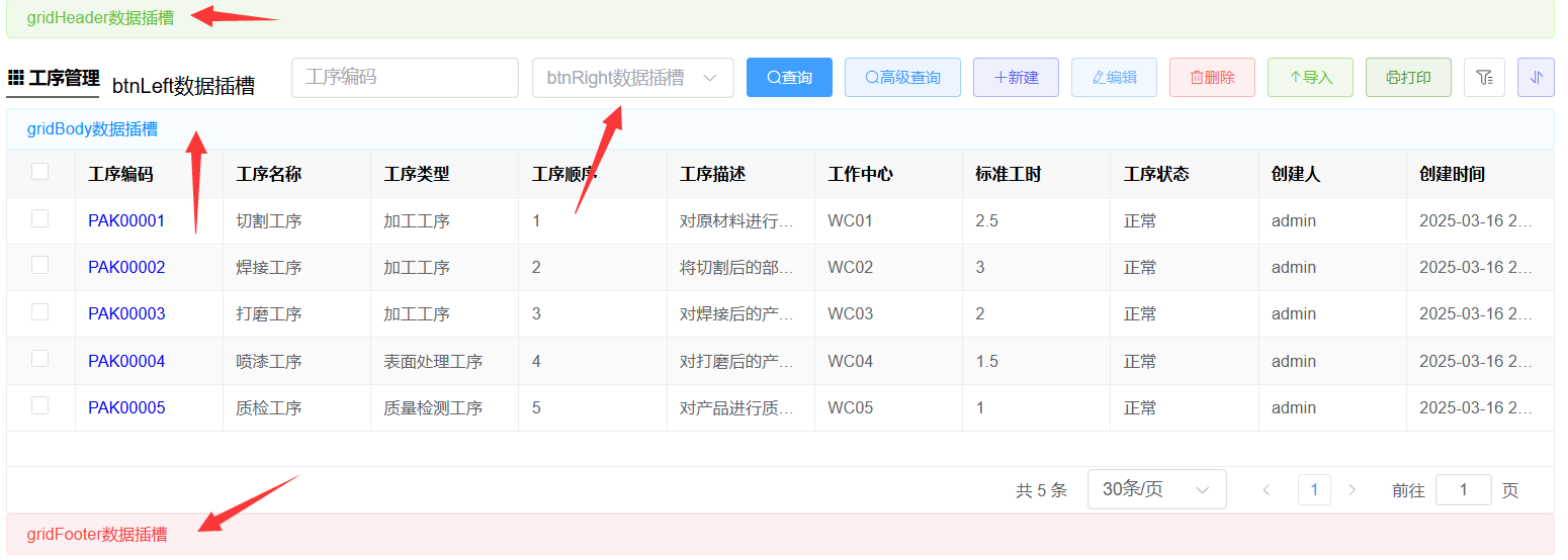
| gridHeader | 列表页面数据插槽 |
| gridBody | 列表页面数据插槽 |
| gridFooter | 列表页面数据插槽 |
| btnLeft | 列表页面按钮左边数据插槽 |
| btnRight | 列表页面按钮右边数据插槽 |
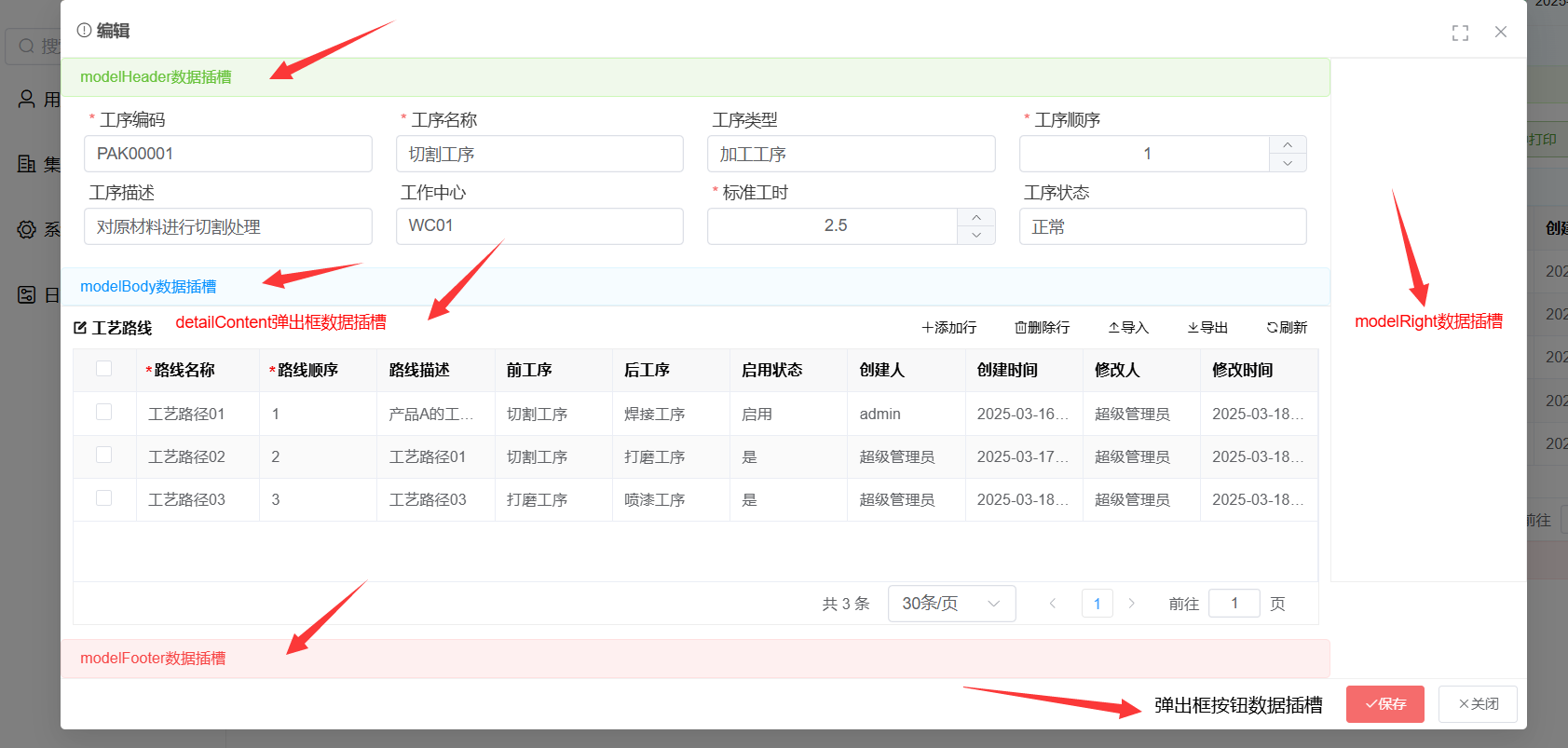
| modelHeader | 编辑弹出框顶部数据插槽 |
| modelBody | 编辑弹出框编辑表单下面的数据插槽 |
| modelFooter | 编辑弹出框明细表下面的数据插槽 |
| detailContent | 弹出框明细表按钮左边数据插槽 |
| modelBtn | 弹出框右下角按钮数据插槽 |
| modelRight | 弹出框右侧数据插槽 |
| importContent | 导入弹出框数据插槽 |
| auditContent | 审批出框数据插槽 |
| auditButton | 审批出框按钮数据插槽 |
| printContent | 打印数据插槽 |
数据插槽使用
使用方式:在生成的【表.vue】文件<view-grid>标签上直接添加
<template>
    <view-grid ref="grid">
        <!-- 自定义组件数据槽扩展,具体位置,请参照下面图片标注位置 -->
        <template #gridHeader>
        <div style="padding: 0 15px">
            <el-alert title="gridHeader数据插槽" type="success" :closable="false"></el-alert>
        </div>
        </template>

        <template #gridBody>
        <el-alert title="gridBody数据插槽" class="alert-primary" :closable="false"></el-alert>
        </template>

        <template #gridFooter>
        <div style="padding: 0 15px">
            <el-alert title="gridFooter数据插槽" type="error" :closable="false"></el-alert>
        </div>
        </template>

        <template #btnLeft>
        <div style="margin-left: 10px;">
            btnLeft数据插槽
        </div>
        </template>

        <template #btnRight>
          <el-select style="margin-left: 10px ;width: 160px;" placeholder="btnRight数据插槽">
          </el-select>
        </template>

        <template #modelHeader>
        <el-alert title="modelHeader数据插槽" type="success" :closable="false"></el-alert>
        </template>

        <template #modelBody>
        <el-alert title="modelBody数据插槽" class="alert-primary" :closable="false"></el-alert>
        </template>

        <template #modelFooter>
        <el-alert title="modelFooter数据插槽" type="error" :closable="false"></el-alert>
        </template>

        <template #detailContent>
        <div style="margin-left: 20px;color:red">
            detailContent弹出框数据插槽
        </div>
        </template>

        <template #modelBtn>
        <div style="margin-right: 20px;">
            弹出框按钮数据插槽
        </div>
        </template>

        <template #modelRight>
        <div style="padding: 20px;color: red;border: 1px solid #eee;">
            modelRight数据插槽
        </div>
        </template>

        <template #importContent>
        <div style="color:red;">
            导入弹出框数据插槽
        </div>
        </template>

        <template #auditContent>
        <div style="color:red;">
            审批出框数据插槽
        </div>
        </template>

        <template #auditButton>
        <div style="color:red;">
            审批出框按钮数据插槽
        </div>
        </template>

        <template #printContent>
        <div style="color:red;">
            打印数据插槽
        </div>
        </template>

    </view-grid>
</template>
数据插槽列表位置
数据插槽弹出框位置